I wonder how many years you have to spend knitting colorwork before your instincts are really worth trusting? I’ve had to make a course correction on my new Winter Garden after it forced me to admit that my initial sense of how to shift between reds, purples, and greens was just flat-out Not Going to Work.
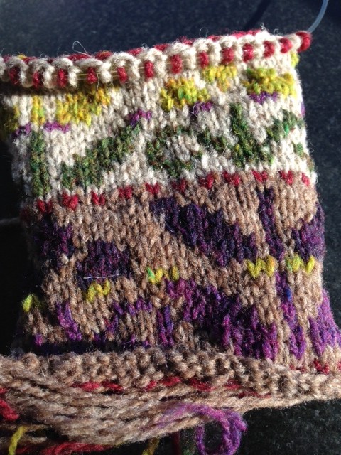
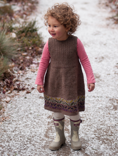
From the moment I knit the first Winter Garden, I had a vision of an alternate colorway for my Ada: a friendly brown dress with the flowers done in greens and reds with purple accents. I had the yarn in hand. But then I started lining up the colors I’d chosen and doubting my wisdom. Artifact had too much black and too much yellow. Homemade Jam looked oddly dull against the other colors in anything less than full sunlight. I swapped them out and still there were problems. Birdbook didn’t contrast with Nest sufficiently, while Long Johns was too potent against Woodsmoke, and Plume bisecting anything was as disruptive as ants scurrying over your picnic cloth in the direction of the cake. Argh. Of course, I only admitted to myself that it had all gone awry after I’d cast on a few hundred stitches and stubbornly knit four fifths of the chart in the hopes that it would somehow all come together. Rrrrrrrrrip!
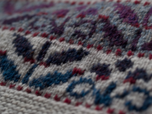
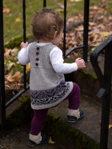
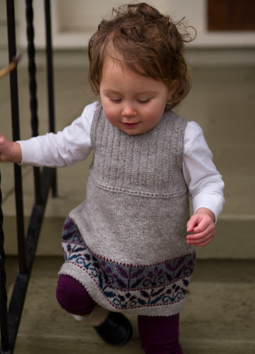
I went back to the original colorway (which had fitted itself together as neatly as you please) …
… and lifted half of it. You can always do something with green and purple, I believe. I upended my progression to keep the greens on the lighter background (Woodsmoke). And as a final touch, I restricted the red to the peerie bands and related the purple half to the green half by lifting Sap to divide the purples, Thistle to divide the greens. And then it worked. Oh, it’s not very traditional, and you could argue that Sap really is a bit jarring and ought to be darker to pair well with Birdbook, but it makes me smile.
I’m still not giving up on the dream of a colorway featuring Birdbook and Homemade Jam. Tent-Birdbook-Homemade Jam-Camper might be the way to go, maybe on Fossil and Postcard with Blanket Fort accents? Here’s the Loft color range so you can see what I mean. What progressions would you try?
